The brief
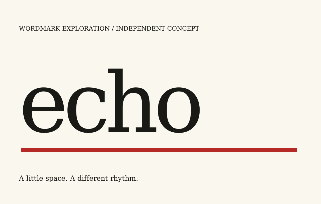
Create a title treatment for a fictional small listening journal. The word should feel resonant without using a speaker symbol or a literal sound wave.
Design decisions
The lower-case serif word uses consistently tight spacing. Rounded letterforms contrast with the tall vertical of the h. A thick red rule runs beneath the whole word, creating a second horizontal line. The small caption sits apart below the specimen.
Taking the idea further
A real application would test the title at cover size and as a small digital mark. The word, usage rights and reproduction constraints should be approved before refining outlines or preparing final vector files.