The brief
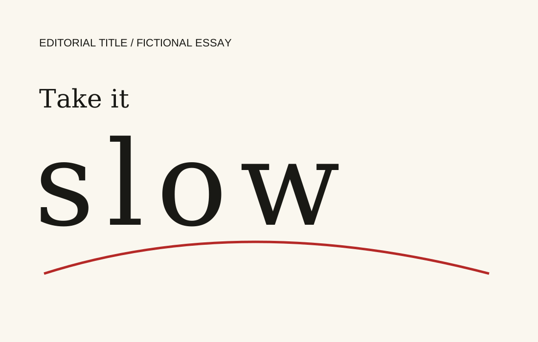
Develop an opening title for an imaginary essay about slowing down. The treatment needs to express an idea before the first sentence, while leaving enough hierarchy for the essay itself.
Design decisions
Tall serif letters are held apart across the available width. The smaller introductory words sit near the left edge, creating a deliberate difference between the brisk introduction and the expanded final word. A single red curve makes the eye travel slowly through the composition.
Taking the idea further
The title is an editorial composition, not a full font. An actual publication brief would define the headline, page dimensions, body type and illustration relationship, with a proof at the final print or screen size.